THE SHINING
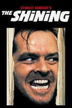
The shining is an iconic horror film which is timeless for its portrayal of modern horror elements within the realms of classic horror, when the genre was first seen as a clear niche market. The shining poster is a still image of the most iconic scene from the films and upholds the timeless elements of the film itself. the close up on the killer ,Johnny's face shows clear isolation from the white background while making the audience fear him as a character due to the breakdown of the doorway he has pushed himself through, almost showing that there is 'nowhere to hide'. The facial expressions also emphasise this to the audience as we fell even more fear due to the absolute focus and rage in the draws eyes and screwed mouth in an almost animalistic attack of his prey. The poster maker also chose for the killer to be looking away form the camera drawing the audience into the story line as they begin to fear, who he is killing and who is going to kill next. The shinimng poster also has large distorted white writing to alsmost higlhight the theme of madness that is potrayed throiugh the fil and allow the audience to both infer this while also infering the snese of purity in the victim, who the killer is looking to. This poster has becomne iconic to horror as it shows the deidcation to the role that the actor potrayed and the still image refernces one of the most well known phrases in horror itself, as a genre... 'Here's Johnny!'.
SINISTER
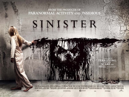
One of the most popular horror movies of 2012, Sinister, have promoted their character list in a very creative and effective way- without making it too in your face. The ink manipulation which strategically forms the face of the antagonist in the movie (the boogeyman) is black; highlighting that the face is evil and sinister due to the intense colour connotations which people are able to make links to- implying this figure will be the villain. The positioning of the girl in the movie poster is very powerful because she is the one dragging the ink, moreover, this portrays the children within the film as dangerous character as they aren't as innocent as expected- Children are potentially being used as an illusion to enhance death, implying they are a brutal weapon.
The child in the poster appears to look in her early teenage years, which stereotypically, is the age when adolescents begin to rebel. This alters the earlier perception of innocence of teens, as we begin to build a further idea regarding their stubbornness and overall attitude. Their vulnerability and pressure of reaching early childhood could lead to children being manipulated away from their family and towards darkness as a result of unwanted commitments.
The font choice used is very dynamic and bold which contributes to the easy identification of the movie, additionally, the shadow like effect of the title merges into the ink portrait of the antagonist which implies a sinister atmosphere will be revealed. The colour contrast of the black on the white suggests a of innocence. The use of the cracks in the white wall is effective as we can infer that it represents the children as not being fully developed, highlighting their vulnerability further- along with the idea that the villain has the ability to take advantage of this.
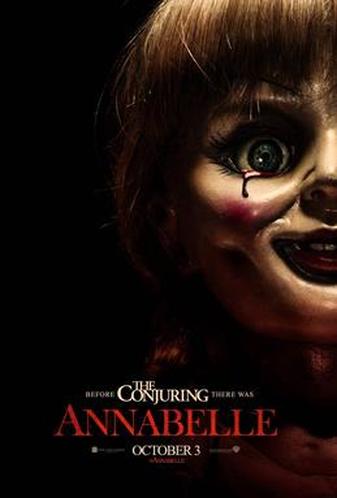
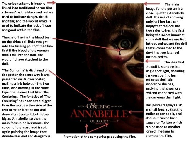
ANNABELLE
|
|
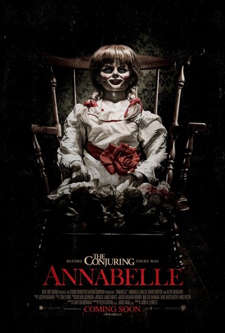
The poster is of the Franchise of Wan's films and focuses on the true case of the 'Annabelle doll'. The poster is a neutral view of Annabelle's whole body where the impending white light from above highlights the darker areas of her face but is contrasted by her almost excitable expression. The use of this light may have been to reference the themes of religion that are present in the film itself and create an almost omnipotent light, where the center character is all powerful, but instead of the realms of good she is powerful for evil.The red rose is also a very prominent symbol within the poster, where Annabelle is placed in a position and stature of importance and the rose takes a part of this. The semantic field of the colour red allows the audience to infer a sense of evil and blood in the horror film and this is emphasised by the blood red title that is under the doll herself which also gives a sense that she is in total power, even over the title of the film. The colour red is also more prominent due to the purity and classic stereotype in horror of the white dress that Annabelle wears.Finally the use of low key lighting as a spotlight highlights certain features on the face of the doll. The eyes are drawn back into the darkness but the whites of the eyes stare clearly into the audience and makes them feel as though she can see you through the poster itself. Finally The Conjuring is also referenced in the poster and is used to draw in a wider audience as they remember their experience form the other film and want to extend that experience
AN EXAMPLE OF HOW CRITICS VIEW HORROR POSTERS
|
|
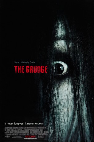
THE GRUDGE
The Grudge uses a very simple cover for their movie poster, the simple aspect is an attempt to minimise confusion to the audience along with preventing too much happening at once -which can disturb a viewer's concentration. An extreme close up of the antagonists eye (The Grudge) is used. This particular shot is effective because it reflects fear which is unusual for a villain to posses. This could therefore imply that the Grudge is actually a prisoner of extreme sorrow and rage.
The background of the cover is black which highlights emptiness, this could be linked to the Grudge as an antagonist has no soul because they have no conscience due to their urge to kill repeatedly without feeling regret. The colour black has connotations of fear, evil, death and power; these are aspects that an audience expects to witness within a horror film. Therefore this particular poster is easy to identify as a horror movie as it contains all the elements an audience would require.
The title of the film stands out as it is written in a red capital letters; the colour red infers blood and danger which implies that the film will be action packed as a result of the violent nature that will be present. Furthermore the red font represents the Grudge as a ruthless and very powerful character.
And lastly, the slogan of the film is located in the bottom left hand corner of the poster, which says, "it never forgives, it never forgets". This slogan is extremely effective and appealing to a horror audience as it reveals that the antagonist has truly evil intentions.
|
|
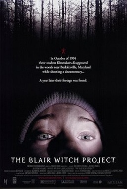
The Blair Witch ProjectThe Blair Witch Project has a very unique colour scheme, although it's black and white its very majestic as a result of the positioning and contrast of the trees in comparison to the darkness of the sky. The editing that has been used is very effective as it reveals a glare on the white background which stimulates a paranormal effect as its a distortion of a perfectly normal image. Furthermore, the colour swap from the sky to the trees causes the audience to wonder what has caused the mysterious glare and they being to form an outlook on what could happen. Additionally, the lack of colour highlights the iconic red symbol which is located in the middle of the poster- within horror, red is a key colour as it represents blood and death which is a classical combination.
The tagline briefly explains the main aspects of the story without revealing too much information; this is beneficial because a large amount of writing could potentially be displeasurable to an audience (if too much writing is present it is likely to be overlooked, therefore the overall image is important). The location for this particular horror movie is in the forest, this is effective as it contributes to the audience's experience- as a result they will feel scared and isolated and are likely to relate to the characters within the movie. Providing a link or hashtag on a poster can help to promote the film further as it gives the audience the opportunity to seek for more information online. If people are prepared to go to the extra effort of glancing online then it is likely that they will establish a trailer, this is good because it allows the movie to me memorable. |
|
A NIGHTMARE ON ELM STREET
|
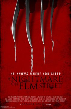
A Nightmare on Elm Street is an iconic classic in the world of horror. When recreated in 2010, the poster took a more simplistic stance, featuring the deathly glove worn by Freddie himself, the minimalistic design allows the audience to focus on the horrific danger that awaits and allows any confusion to be eliminated. The fact that only the glove is shown gives a sense of mystery however keeps up the idea of danger, due to the fact that it is shown only leaving scratch marks rather than graphic injury with blood. The original film kept blood pressure high due to the unknown ongoings of the killer. The fact that a neutral mid shot of the glove allows the audience
|
|
|
|
